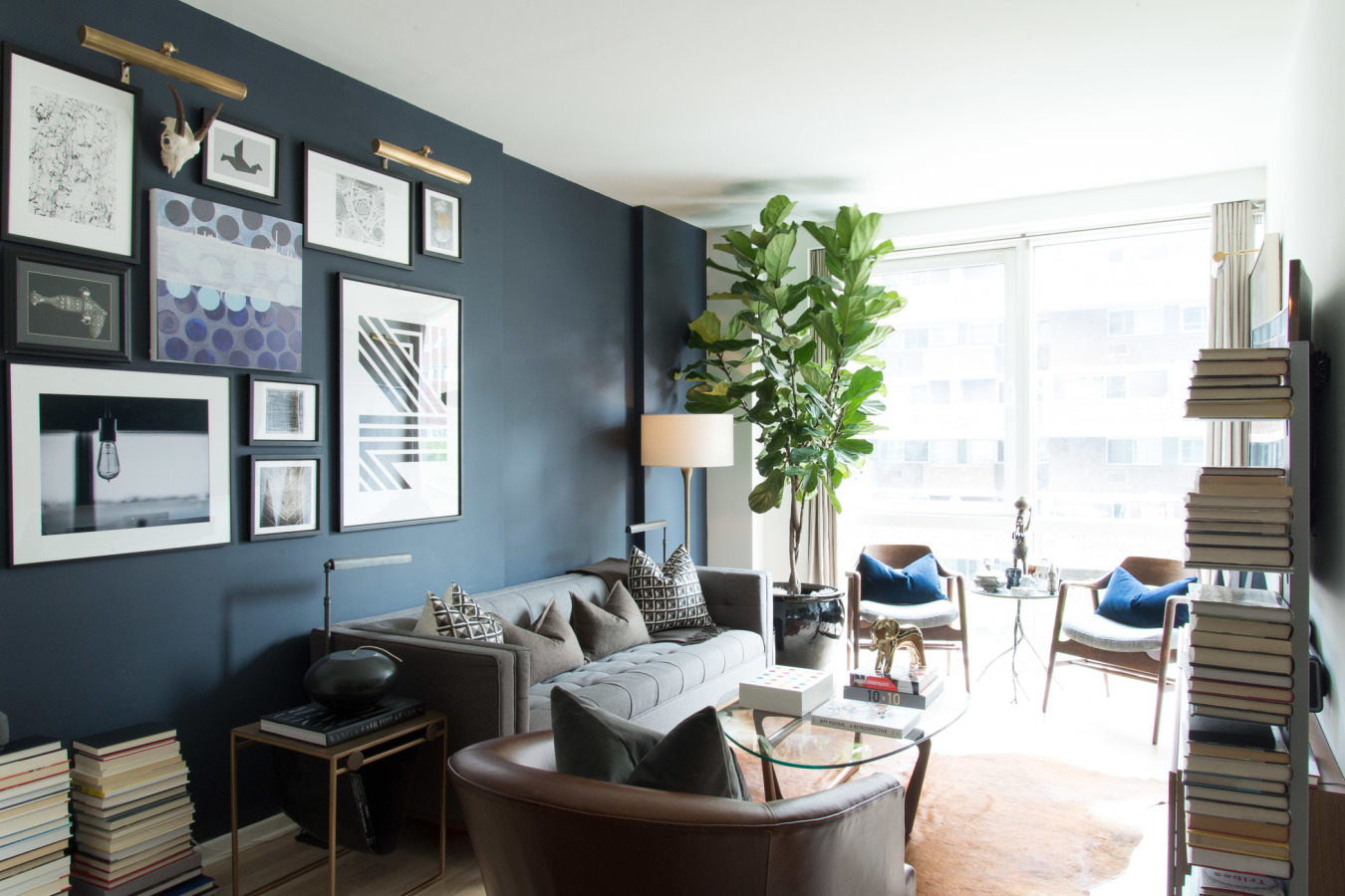
Over the past few months, I’ve had a lot of interest in the project, Gramercy, New York. I want to break down Gramercy in a few separate posts to detail how I designed this apartment and the ideas that went behind it. For this first post, I am going to break down the layout of this space. It’s so important that the layout is right for your space so that all the elements, such as the gallery wall and giant ass fiddle leaf tree, shine through!
My biggest thing as a designer is that a layout has to not only function for my clients, but it also needs to make sense! I see projects where things or furniture seem to just been placed to fill the space (I’ll get into how negative space can be a good thing in another post) and it just looks forced and awkward. So not chic. When you walk into a room, you should never be struck with an obstruction. It should always feel open and welcoming. This is why I placed the two chairs near the window. The window seating area allows for the most natural light into the room. Having two pieces of furniture in that area will make the space feel less heavy than if you were to have had the larger leather chair there. Also, the leather chair can swivel and be moved to the corner where the reverse books are. It also can swivel around to join the dining area. The sofa was placed against the left wall because the view is of the water from that side. Placing the sofa here allowed for a cool juxtaposition to the inset in the wall where the gallery art is hanging. Ultimately, the seating areas create what I call a traffic flow. It allows for a casual observer or guest to move through the space effortlessly and comfortably without jarring their motion. Laying out the room like this allowed us to achieve the key factors we were aiming for.
The idea of having the floating media unit gave the room negative space we needed. Not only did it make the area lighter, so to speak, it also allowed the showcase of all of my clients’ crisp white magazines that he has been collecting over the years.
Another element we were able to achieve through this open layout was the lighting. Because of the way we designed the room, we were able to take advantage of natural lighting to showcase the art and also brighten the space. We also incorporated floor and task lighting to cater to my clients’ #bookaddicted reading habits without creating a harsh, overhead and artificial LED spotlight affect.
Also, because we were playing with a lot of linear qualities within the space, round tables were the best way to go. The coffee table is an oval and the side table is also round so that the two chairs can fit comfortably within the small space, and hold a drink of course. Not only do round + oval tables offer the best solution for traffic flow, but they also adhere to space restraints. Finally, the round pieces we chose allow for more light to come into the space because they have thin legs and a glass top.
I hope this helps you with your layout woe’s. Remember, just think “does this layout make sense? Am I just filling this space because I feel like it needs to be filled or does it work within my overall vision?”
xx,
#hfc

