Are you guys ready for allll the details on this project?! I’m so excited to share everything with you all! I started this project last April and worked on it for about 9 months. The apartment is a 900 sq. ft. 2 bedroom, 1 bath. When my clients first bought the apartment it was far from their taste and style. It was serving all sorts of 90’s over the top décor vibes with oversized Italian light fixtures, dark paint-textured walls, and had light stained hardwoods throughout. I attached before images so you guys can get a true sense of how crazy the before and after really is. After I do a project, I’m still even shocked by what a before and after is like. A fresh coat of paint, staining the floors and changing out all the light fixtures already did wonders!
My clients knew they wanted a luxurious-glam feeling, without the stuffiness or being uncomfortable. Through a color palette of soothing grays, luxurious textures like velvets and faux-furs and a highlight POP color of teal, we were able to achieve the vibe they desired. Lets break down the living room first..
Living Room
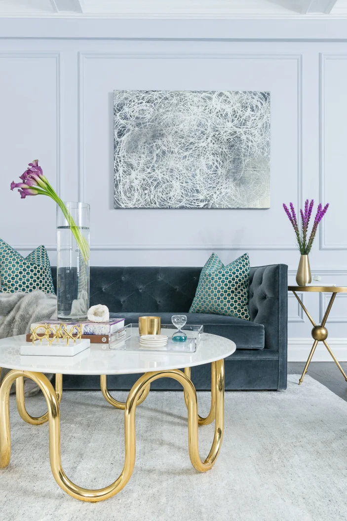
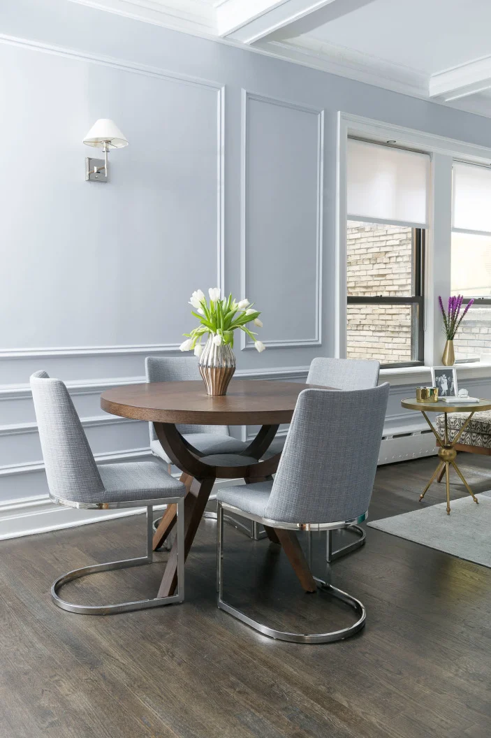
First, we needed to lay down the foundation of the room. Newly stained hardwood floors; a custom color of a mix half-ebony stain | half-espresso was how we got the floors to be dark, but not looking too heavy or black. Next, painting time. All the walls and moldings are painted tone-on-tone using Sidewalk Grey by Benjamin Moore, flat finish. All the trim work is Decorator’s White by Benjamin Moore. All the sconce lighting is Restoration Hardware.
Being that the room is very long and quite boxy, I knew that round was going to be an important factor to consider in choosing the larger pieces. A modern take on a traditional style round dining table by West Elm paired with chairs from OKL, set the tone for the room. My client knew she wanted to include marbles and brass into the mix, so when we found the Jonathan Adler coffee table, we knew we hit it big. This was going to be our wow piece in the room and would allow us to play off of the white marble top and curvy brass legs for the rest of the rooms overall vibe. A muted velvet tufted sofa from Room&Board paired with an understated, but equally as chic, rug by Mitchell Gold + Bob Williams allowed the table to shine. The credenza, also a Jonathan Adler find, break’s up the adult vibe in the room by adding a bit of modern sass we needed. My client loved pattern, but didn’t want it to dominate the room. A simple patterned Dwell Studios bench and custom velvet hexagon pillows from ETSY, yes ETSY! added the patterns we were looking for. The POP? A teal velvet round swivel chair from Room&Board stands out strong against all the muted greys. The painting is a custom piece by my clients friend. We knew we wanted it to play off of the round and curves of the coffee table. Still one of my favorite pieces in the apartment.
Staying true to the overall vibe of the apartment, the master needed to feel warm and inviting, but clean, modern and of course, chic. For this room we chose Coventry Grey by Benjamin Moore. I love this grey because it’s a tad darker, but not overpowering and heavy. My client knew she wanted to incorporate mirrors into the furniture, so they were our front-runner. The nightstands are from OKL and the larger mirrored dresser is from HORCHOW. The bed we found at Wayfair for an incredible price (it’s a Queen) and was under $800 and the quality is superb. The chandelier, also a OKL find, adds that extra bit of femininity to the room mixing modern by the beautiful silver ball surrounding the crystal lights. All the bedding we found at Restoration Hardware. I loved the bedding because it had the tufting stitch texture, same as the headboard, but in a rich charcoal color to add some masculinity to the room. Again, playing off that idea of solids, the addition of a geometric patterned rug from Rugs Direct really was able to highlight the bed and nightstands.
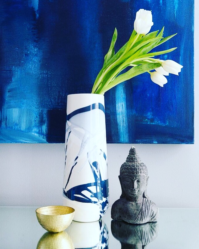
The painting, also another custom piece by my clients friend, added the POP color of blue in the room to break up all the soothing greys.
Lamps-OKL Accessories –CB2, Jonathan Adler
We also switched out all the hardware in the entire apartment to Baldwin that we got from HomeDepot.
Nursery for TWINS!
One more bedroom to go. During our final walk-through of the space, my clients told me in this bedroom, surprise we’re pregnant and with TWINS! Of course I was elated for them as this was going to be their first child and two none the less, but we literally just finished the guest bedroom, so time for a nursery make-over, over a make-over? Either way, so excited! The nursery is currently being held for a special feature somewhere and I can not WAIT to share it with all of you! Definitely a career changing moment for me, as I never really wanted to ever get into nursery design and now it is my absolute FAVORITE room to design.
Stay tuned!
Let me know what you guys think and if you have any additional questions on any pieces or anything!
xx
matthew


