A Modern Triplex in Greenwich Village


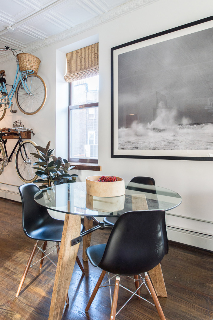
For a young family living in New York City, a triplex property with high ceilings, two floors and a master loft suite was more than desirable, it was Manhattan real estate GOLD.  My clients knew they wanted the space to be clean, modern and function well for their growing family.  Implementing design elements such as custom lighting, multi-functioning furniture and a play off of black-and-white w/ POPS throughout the decor, took this triplex to new heights of design. For more details on this project, click through the gallery or check out the full post on my blog w/ a special feature in MYDOMAINE!



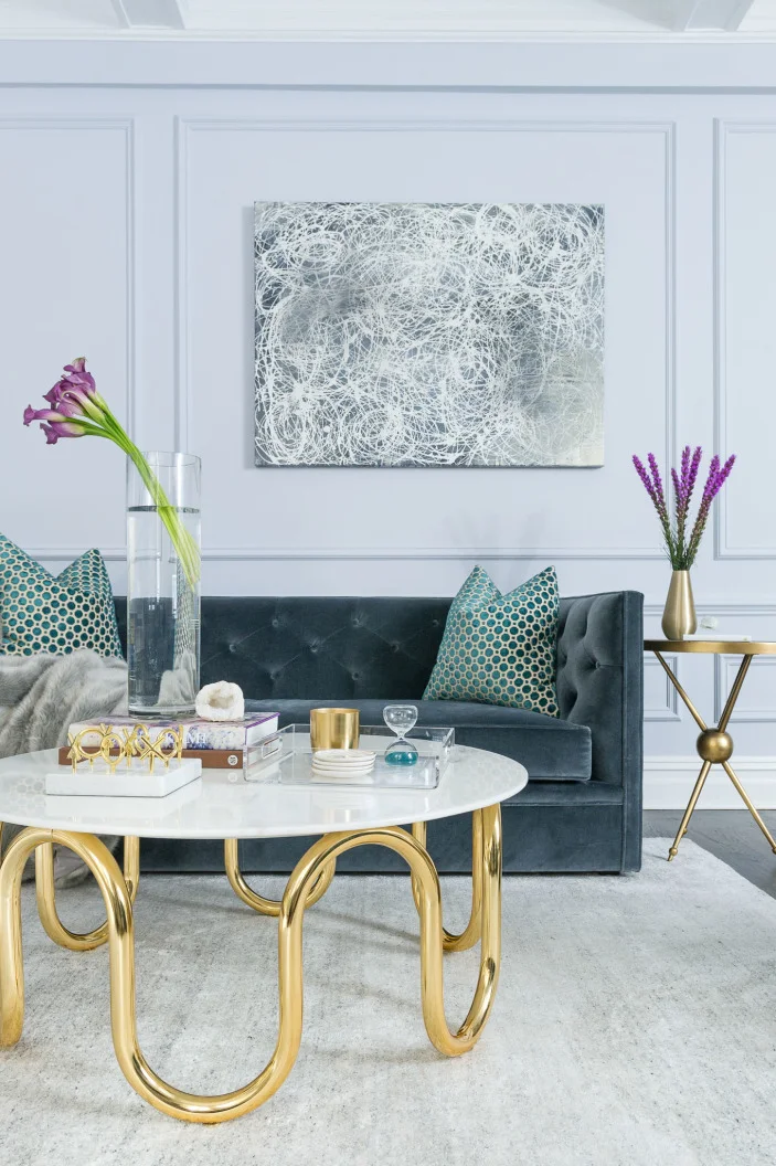
REGAL CHIC


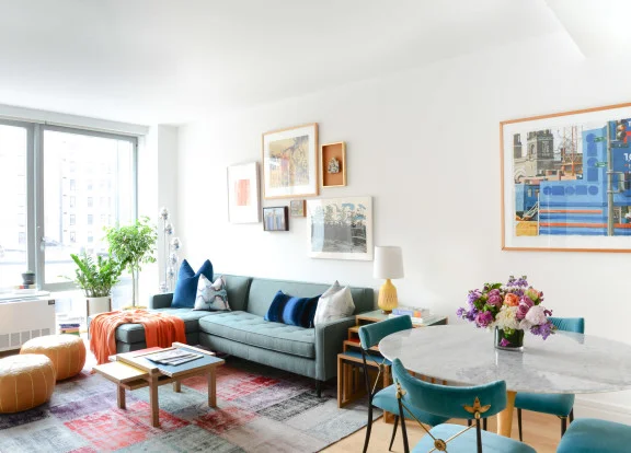
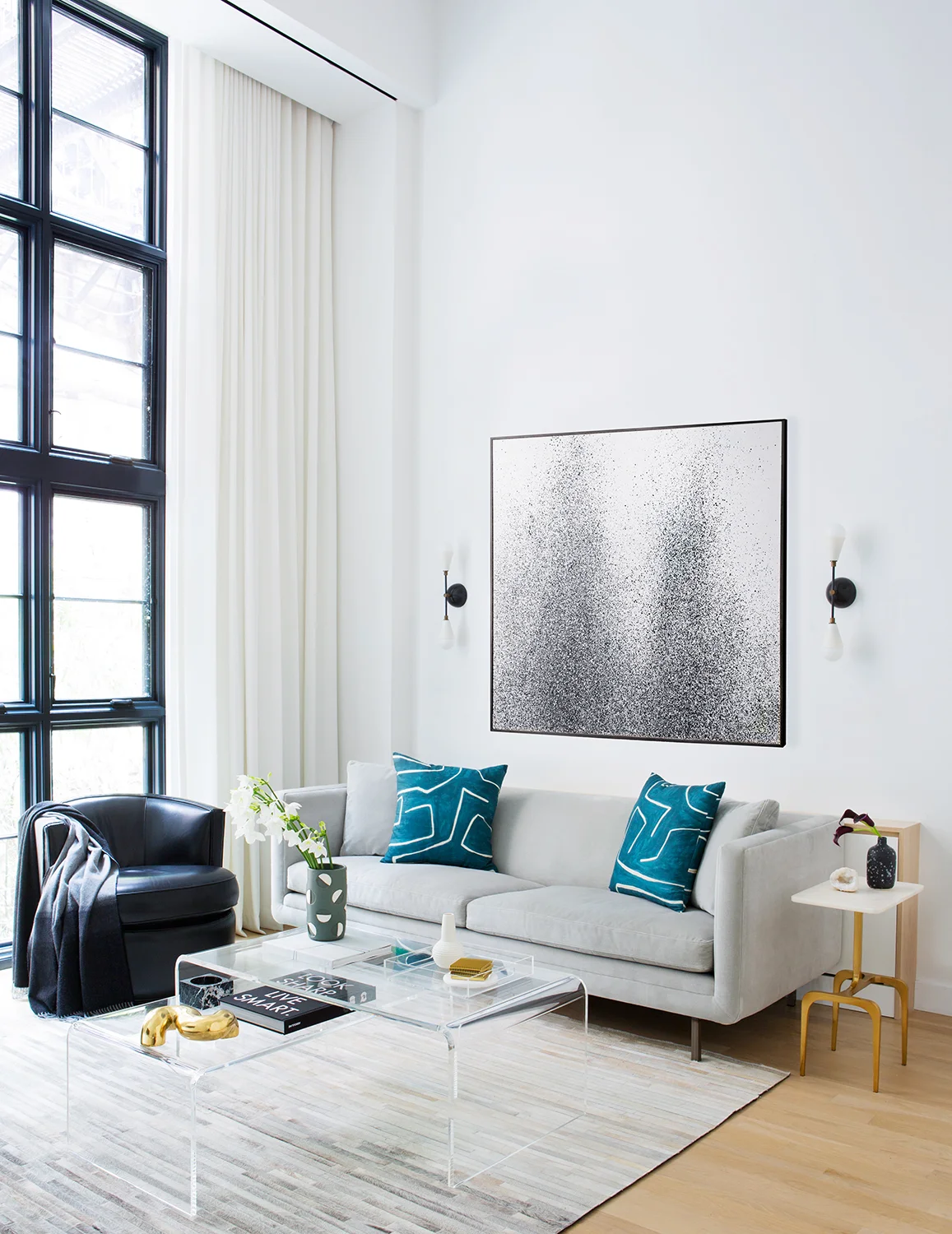
The subtle unique details in this space make it one of my favorites to design.  My client wanted the space to feel luxurious, yet inviting and comfortable.  With a palette of soothing grays, luxurious textiles like velvets and faux-furs, a POP color, and one of a kind art, we were able to achieve the inviting lux-glam vibe they had envisioned.  Regal Chic features two rooms; a living room with a dining set and a master bedroom. To view before & after photo's and learn more about the design process for this project, please check out my blog.


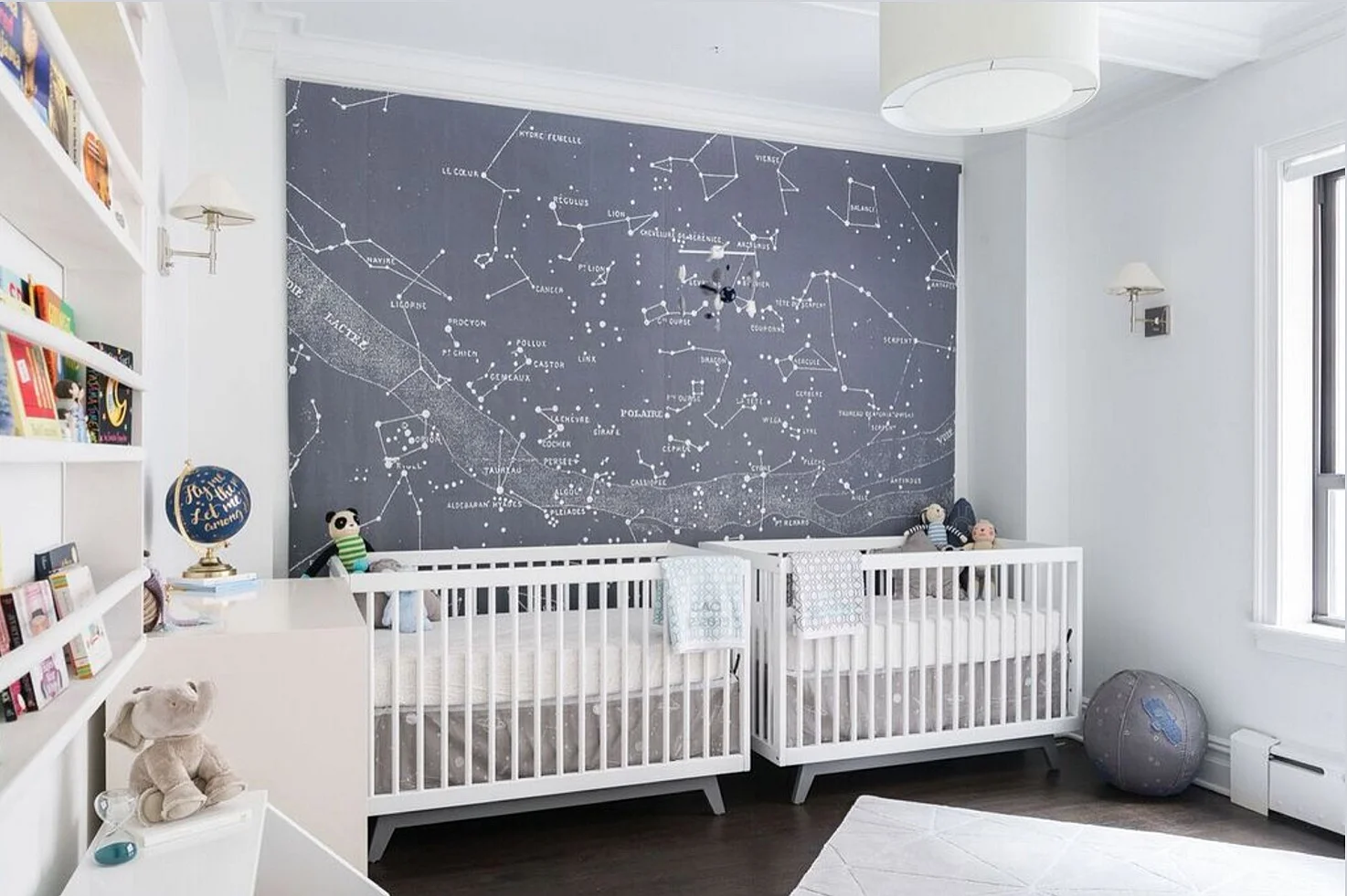
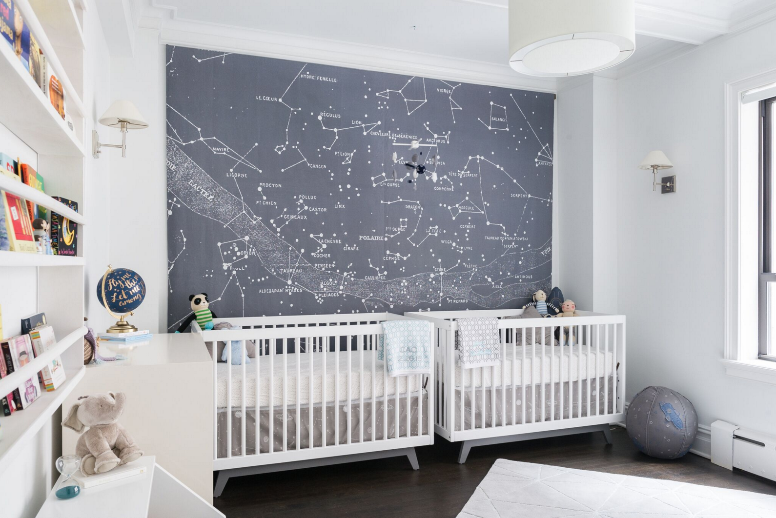
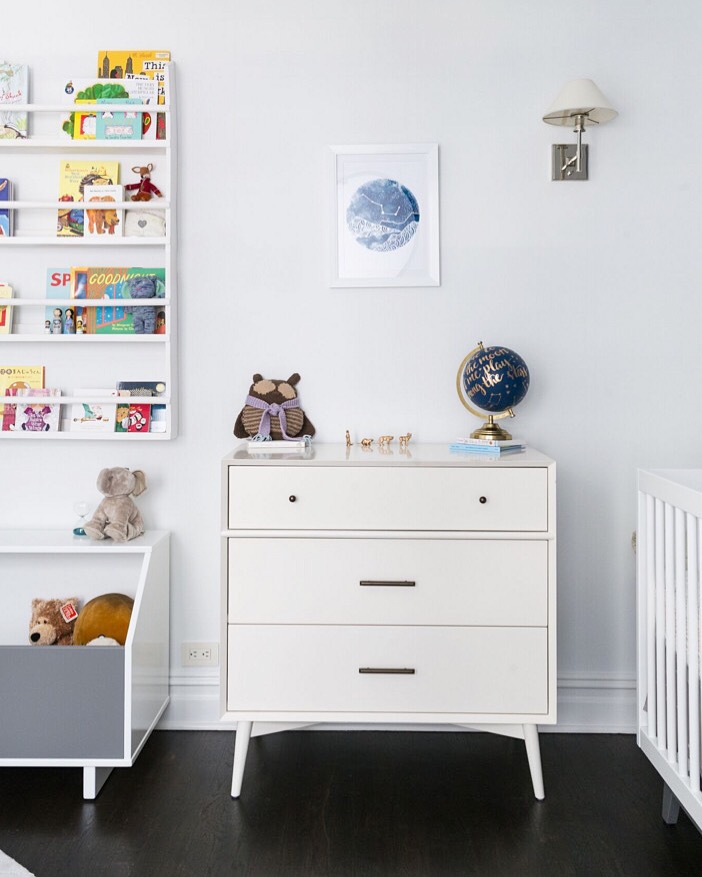
Astronomy Nursery


It is important that nurseries and children’s rooms carry the same love, energy, and detail held in the main rooms of the home. They should be designed so that the space grows with the child.  By mixing more adult-like furniture with whimsical-themed accessories, like bedding, mobiles and toys, the room is a special place for children and parents. Creating this nursery for the twins was truly a joy!  I know that this is a magical place of play, growth, and function.  Designing Nurseries and children's rooms has since become a specialty of mine. For more details on the Astronomy Nursery, please check out my blog post.


Handsome Gramercy Abode


The challenge in designing this apartment was what to do in a confined space.  How do you configure a layout in a city apartment so that one can come home and feel a flow of energy.  Each piece of furniture was carefully curated to be multi-functional and aesthetically sound. The window seating area was a favorite spot of mine to design, as it basks in the most natural light in the room.  The sofa was placed against the left wall with a view of the river, while the sofa sets a focus for the gallery wall.  The seating areas create traffic flow.  While the vibe is masculine, defined by sharp lines and sleek textures, the thoughtfulness of the space makes it personal and inviting to anyone. 

 
Lima03.jpg

BROOKLYN BlONDE'S TOWNHOUSE


I had a blast working with Helena Glazer, of The Brooklyn Blonde Blog, on re-designing her Townhouse. We collaborated with Homegoods, which brought on a new type of challenge. But collaborating with one brand for interior pieces proved to be an amazing match made in heaven.  The project design includes the entryway, living room, dining room, bedroom and nursery for this soon-to-be mother.  What was so fun was that Helena and I were a team, we shared a creative vision and inspired each other along the way to create a space so unique to her, a space will grow with her family and success.     


Stockholm02.jpg

CHINATOWN LOFT


The clients needed a seamless fuse of two distinct styles, taking it from bachelor pad to sophisticated home. A balance of masculine and feminine details keep it homey for the couple, while the vignettes strategically cut up the open floor plan. 


Stockholm02.jpg

COLOR CHIC


Color Chic is a gem on the Upper West Side, serving as the couple's home away from home. The color scheme for this Upper West Side getaway apartment was inspired by the couple's incredible art collection that had been specially curated over the years. The collection led to a pallet that was unique to the clients aesthetic. For more information on this brilliantly bright oasis, please check out my blog post.


Homepolish-13527-interiors-3633167f-1350x900 (1).jpeg

CASSANDRA BODZAK'S CALMING OASIS


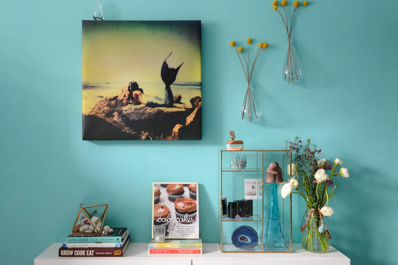
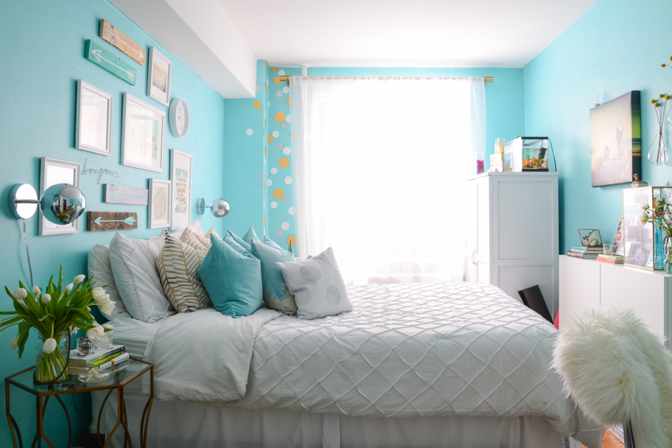
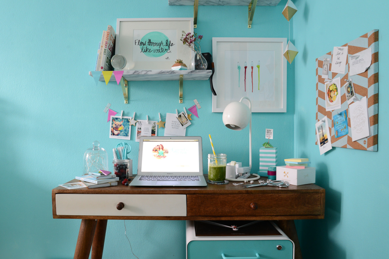
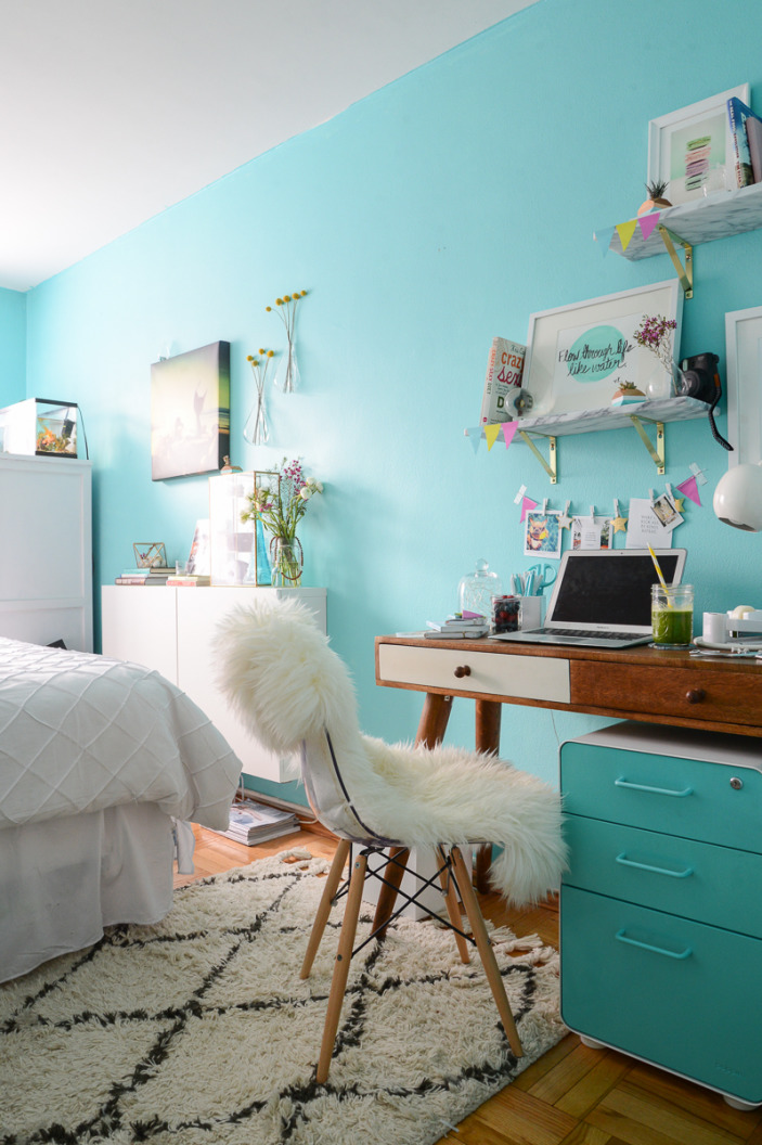
Cassandra is a wellness and life coach, and a chef specializing in clean eating. She meditates on a daily basis, loves traveling, culture and has an obsession with Paris, so we wanted to bring all of these elements into the room's design. We added touches of golds, silver, and natural elements, such as woods and metals to create a zen, feminine, earthy atmosphere. The teal wall color choice spoke to Cassandra's bright spirit!


Stockholm02.jpg

LILLIANA VAZQUEZ'S HOME OFFICE


Lilliana, host of New York Live, needed her Chelsea home office re-designed to match her stylish and fun aesthetic with her professional needs. Golds, corals and her fashion inspirations decorate the sunny space, showcasing her personality in the patterns, textures, and pieces she has collected over the years!

 
Stockholm02.jpg

UPPER EAST SIDE RESIDENCE


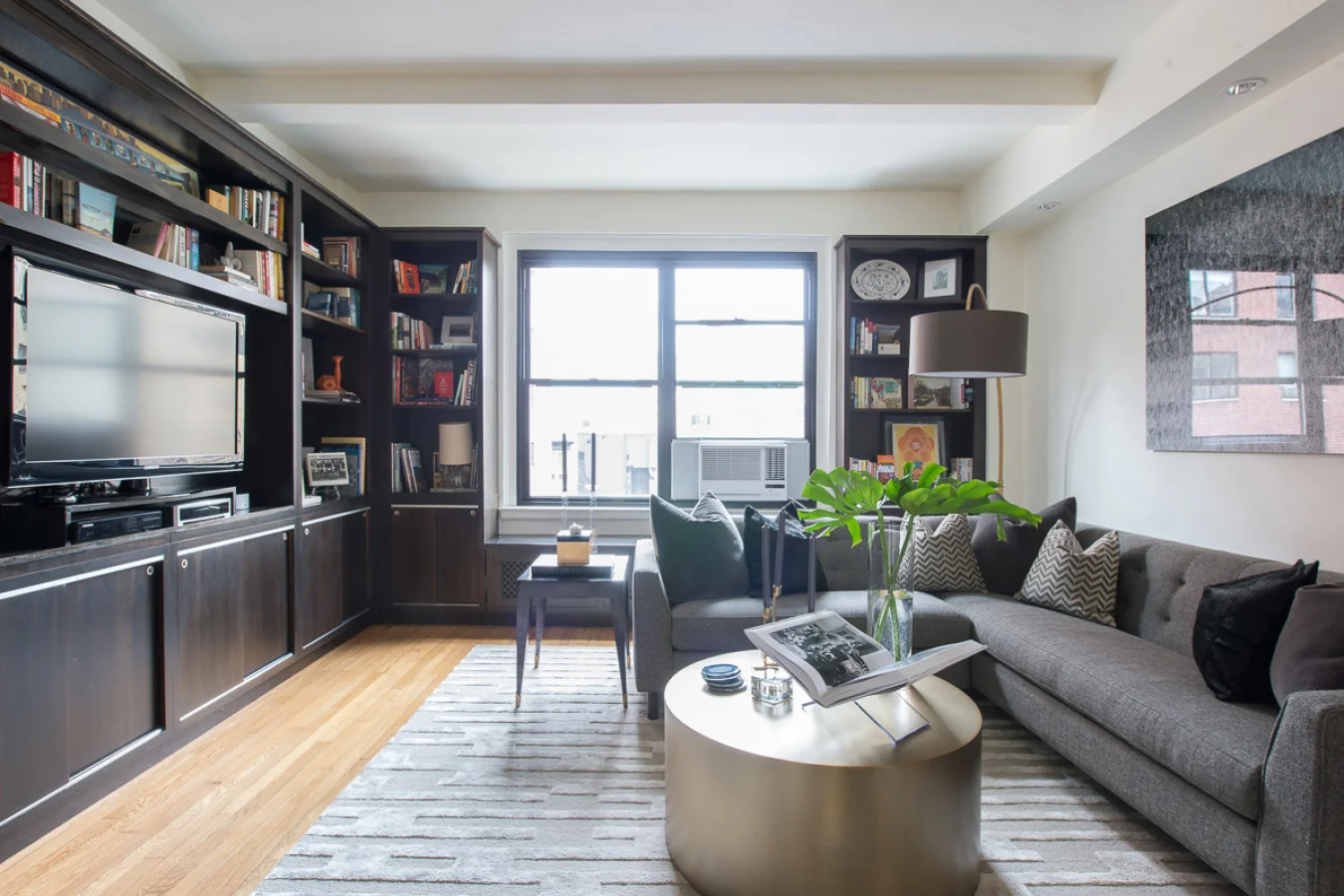
This apartment has beautiful bones.  I walked in to a clean slate, so we had such a wonderful time designing the space with new furniture, wallpaper, and accessories.  My clients wanted to achieve a glamorous masculinity in the space. The goal was to create a chic home fit for a cocktail party or a cozy movie night, any day of the week.


Stockholm02.jpg

LULU'S OFFICE


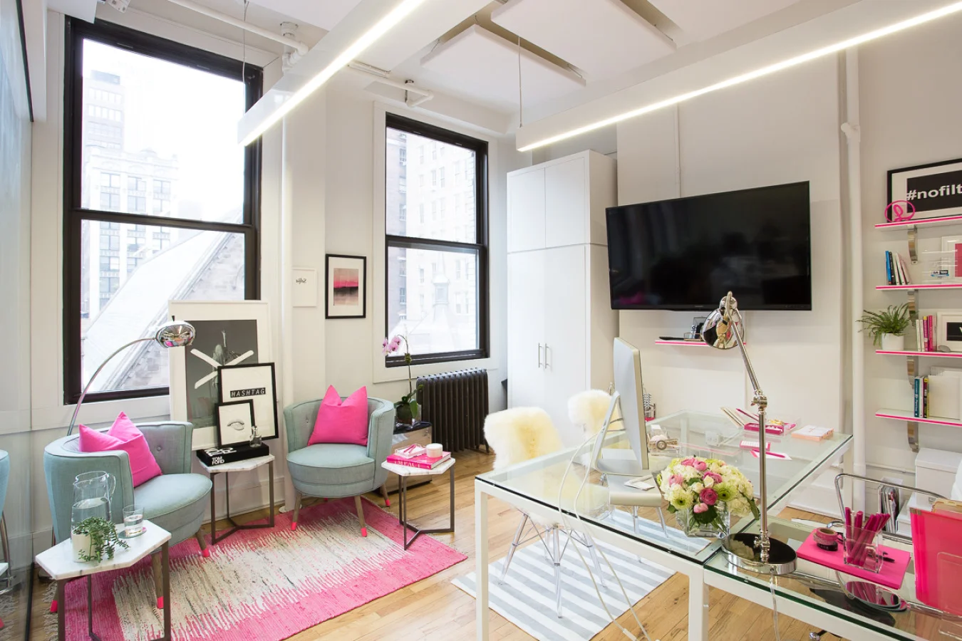
My client's personality helped me design this office.  She is confident, bigger than life, feminine, sweet and sassy, and knows what she wants.  Pops of pink and unique, modern pieces of art draw the eyes up and around the room. Neon pink tape lines the shelving units for an added pop detail.  Your office should have flow as well.  We achieved this by creating separate spaces for business and pleasure within the office.


Stockholm02.jpg

STONE FOX SHOWROOM


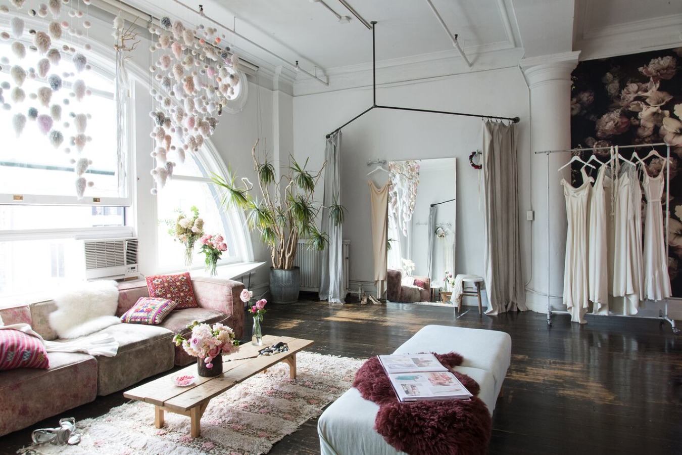
From the moment I toured the space, I knew that the arch windows would be the focal shape in the room.  I wanted to rearrange the space to show off the the product.  The sunlight shows through the translucent ivory and white fabrics, casting a soft spotlight on the products.  The office was formerly closed off, so I decided to open up the floor plan, while still maintaining clearly delineated spaces for different roles and functions. It is now both a retail space and office, and a place to host potential clients. 


Stockholm02.jpg